Choosing the right interior paint colors for your new custom home isn't just about picking shades you like from a tiny chip. It's a thoughtful process. You have to start by looking at your home's fixed elements—things like flooring and cabinetry—then consider the unique intensity of the Florida light, and finally, create a cohesive palette that flows beautifully from room to room.
Honestly, the best way to get it right is to test large paint samples in your actual space before the first can is ever opened.
Building Your Perfect Florida Color Palette
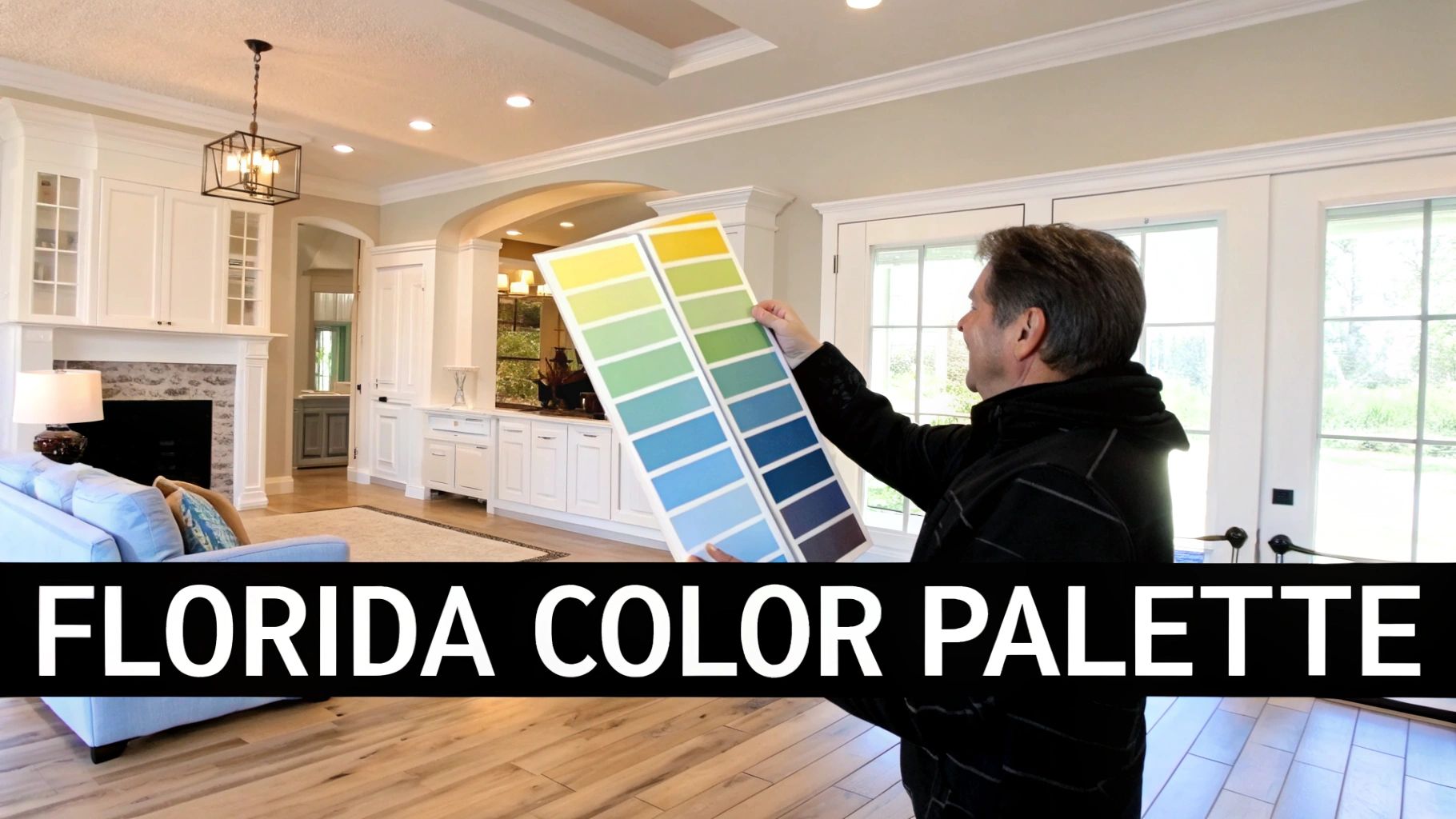
When we build a custom home here in Southwest Florida, the paint palette does so much more than just add color. It's really about setting the tone for a lifestyle that’s all about sunshine and coastal elegance. This process is about crafting an atmosphere that truly complements the unique architecture and high-end features of a Sinclair Custom Home, from our handcrafted wood cabinets to the detailed trim work we're known for.
Forget about the fleeting trends you see on national design shows. Here in Cape Coral and Fort Myers, our goal is to create a timeless, luxurious feel that holds up against our intense sunlight and high humidity. Think of it as a foundational design choice that has to integrate with every other element in your home, from your elevated foundation to your hurricane-impact windows.
Harmonizing with Florida's Environment
Your home's color palette should be a direct response to the world right outside your windows. The brilliant, year-round sun in Florida can completely wash out pale colors and make bold ones feel overwhelming in ways you wouldn't expect. This is why you need a thoughtful approach to create a color story that feels both intentional and perfectly suited to our local aesthetic.
Here’s what we always consider when building a palette:
- Embrace the Coastal Influence: Soft whites, sandy beiges, and muted sea-glass greens are classics for a reason. They create an airy, tranquil vibe that connects your interior to the stunning local landscape just outside.
- Complement High-End Finishes: Your paint choices must enhance, not compete with, Sinclair's signature real wood cabinetry and fine trim details. A well-chosen wall color makes these features the star of the show.
- Plan for Open-Concept Living: Modern Florida homes often feature those beautiful, expansive great rooms. A unified color scheme ensures a seamless visual flow from the kitchen to the living and dining areas, making the whole space feel larger and more cohesive.
Aligning with Modern Design Trends
Staying current is important, but choosing wisely is absolutely essential for long-term value. One of the biggest trends we’re seeing from new home builders is a move toward grounding, nature-inspired hues. It’s not just a fad; a whopping 65% of paint sales in 2025 are expected to come from earthy tones like beige, olive green, and terracotta. This reflects a deep desire for wellness and sustainability in our living spaces.
Your home's color palette isn't just a decorative choice; it's a structural element of your design. It should feel as thoughtfully engineered as your home's hurricane-impact windows and foundation elevation.
To get started, it's always helpful to see what's out there. Take some time to review the current popular interior paint colors from leading brands to gather inspiration for a look that will feel both fresh and timeless for years to come.
Working with Florida's Intense Natural Light
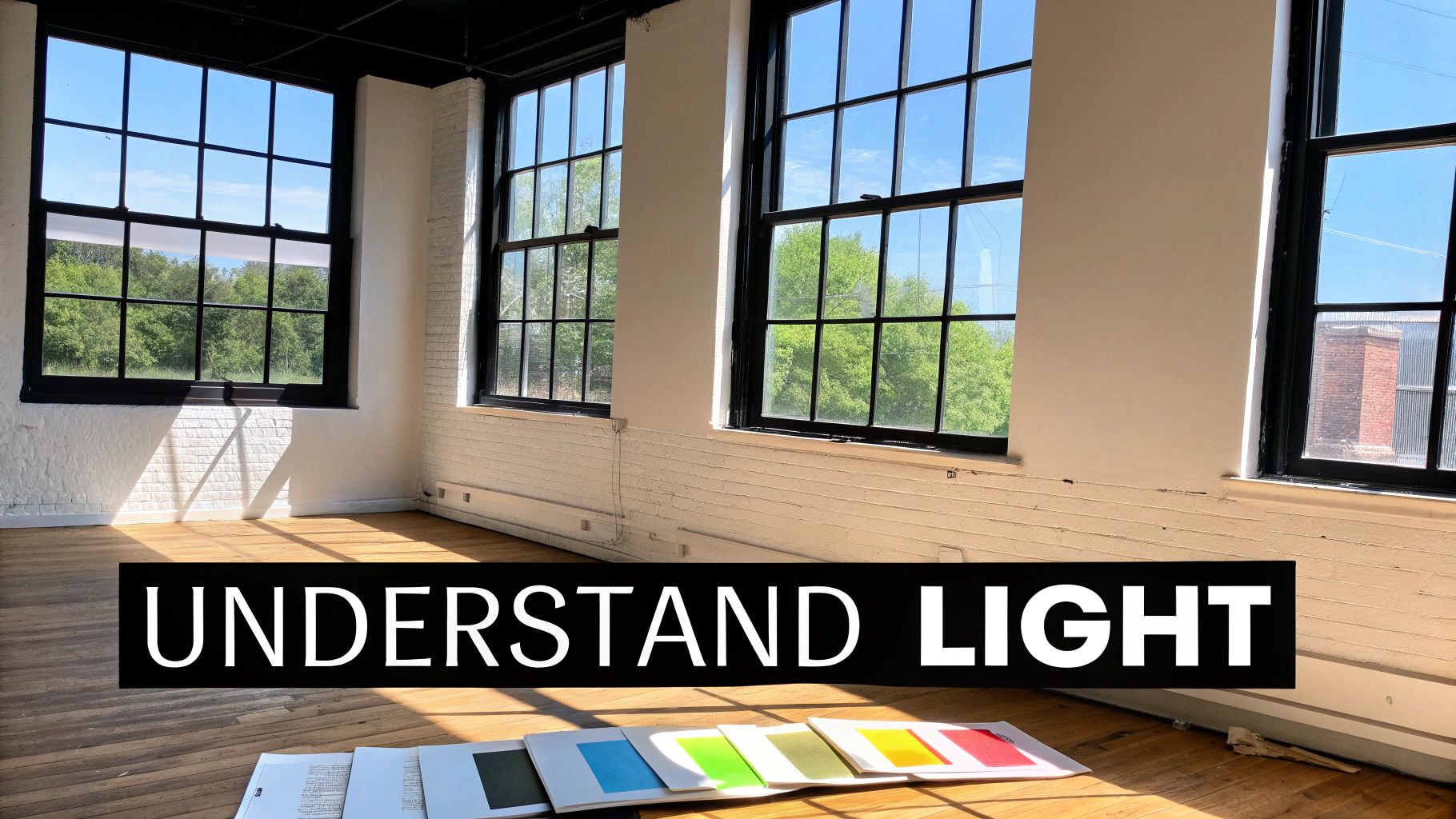
Here in Southwest Florida, that brilliant, unwavering sunlight is a huge part of our lifestyle. It’s exactly why we design our custom homes with massive hurricane-impact windows—to let all that gorgeous light in. But that same powerful sun can completely change how a paint color looks on your walls.
I've seen it happen dozens of times. A color that looks perfectly soft and subtle in a showroom can suddenly turn stark and washed out under the intense afternoon sun of a Cape Coral great room.
The key is understanding that the light isn’t consistent. A room's orientation to the sun dramatically shifts how you perceive color. North-facing rooms get a softer, cooler light that can make colors feel a bit darker or grayer. On the other hand, south-facing rooms get blasted with warm, intense light all day, which can really crank up warm tones and wash out cooler ones.
East-facing rooms are bathed in that crisp, clear morning light, while west-facing rooms get that warm, almost orange glow in the late afternoon. Thinking about these daily changes is the first real step to picking a color you'll love at sunrise and sunset.
Decoding Color Undertones
This is where most people get tripped up. The single biggest mistake I see is choosing a color without paying attention to its undertone—that subtle, underlying hue that only seems to pop out under certain lighting. It’s the reason a seemingly perfect greige can suddenly look purple, or a chic off-white looks strangely yellow against your beautiful custom trim.
Florida's intense sunlight is notorious for exposing these hidden undertones. A color with a hint of green might look perfectly balanced in a store but turn overwhelmingly minty in a sun-drenched Florida room.
Here’s a quick pro tip: To spot an undertone, compare your paint chip to a pure, primary version of a color. Put that gray swatch right next to a pure blue. You'll instantly see if the gray leans cool (with hints of blue or purple) or warm (with hints of green or yellow).
The goal is to work with the undertones, not against them. If your home has warm-toned wood floors, a paint color with a complementary warm undertone will create a cohesive, professionally designed feel. If you try to fight it with a clashing cool undertone, the whole space can feel disconnected and just… off.
The Impact of Finishes and Architectural Details
The paint's finish also plays a massive role in how it behaves with light. A glossier finish reflects more light, which can be a double-edged sword. In a room filled with hurricane-impact windows, a high-gloss paint can create a distracting glare, whereas a matte finish will absorb light for a softer, more velvety look.
Keep these details in mind when you’re narrowing down your choices:
- High Ceilings: The grand, elevated ceilings in so many new Florida homes mean there's a lot more wall space for light to bounce around. A color will almost always look a shade lighter on a big wall than it does on a tiny paint chip.
- Permanent Fixtures: Always, always look at your paint samples next to your stone countertops, tile backsplash, and the custom wood cabinetry Sinclair is known for. These elements have their own undertones that your wall color needs to get along with.
- Paint Sheen: The sheen level impacts both color perception and how durable the paint is. We've put together a complete guide that breaks down how different types of interior paint finishes work in different rooms, from busy hallways to humid bathrooms.
By really analyzing the light in your space and getting a handle on undertones, you can choose colors that stay true and beautiful, perfectly accentuating the luxury and craftsmanship of your new Florida home.
Creating a Seamless Color Flow in Your Home
When you walk through a thoughtfully designed custom home, you can feel it. There’s an intentionality to it, a story told by colors that flow effortlessly from one room to the next. This is especially true in the open-concept layouts we love in new Southwest Florida homes, where your line of sight can travel from the kitchen, through the great room, and right out to the lanai. To get that truly harmonious, high-end feel, you have to think beyond just one room at a time.
It all starts with a whole-home color palette. Now, that sounds more restrictive than it is. Think of it as a framework, not a cage. The goal is to make the journey from one space to another feel completely natural, avoiding that jarring feeling you get when a hallway dumps you into a room that feels like it belongs in a different house entirely.
Building Your Cohesive Palette
The secret to a seamless color flow is picking one dominant, primary neutral to be your anchor. This is the color you'll use in the big, open areas and the spaces that connect everything, like hallways. It’s the visual thread that ties the entire design together. Once you’ve got that anchor, you can start layering in personality.
- Define Zones with Color: In a sprawling open-concept space, you can subtly define different areas—like a dining nook or a cozy reading corner—by using a shade that’s just a touch lighter or darker than your main neutral.
- Introduce Accent Colors: From there, pick two or three complementary accent colors to weave throughout the home. You might use a calming sea glass green in the living room and a sophisticated navy in the adjoining study, but because they’re both grounded by that primary neutral, the spaces feel connected, not chaotic.
- Unify with Trim: This is non-negotiable. Using a single, consistent trim color throughout the entire home is one of the most powerful tools for creating a unified look. It acts like a clean frame for all your wall colors, making the whole design feel polished. A crisp, classic white is almost always the perfect choice to make Sinclair's high-end trim and moldings pop.
I’ve seen this work beautifully when a client transitions from a warm, sandy beige in their great room to a cooler, soft blue-gray in the kitchen. What makes it work? The connection is maintained by the shared bright white trim and consistent flooring, which allows each room to have its own vibe while still feeling like part of a cohesive, well-planned design.
Looking ahead, the industry is leaning hard into this desire for comfortable, cohesive spaces. For example, the newly announced 2026 Color of the Year, Universal Khaki, is a perfect example—a sophisticated neutral designed to create a sense of well-being. This trend toward comforting, versatile colors aligns perfectly with the goal of building a Florida custom home that feels like a true sanctuary. You can see more on future color trends over at Elle Decor. The big idea is to create a color palette that’s as solid and dependable as your home’s elevated foundation.
Of course, this same logic of creating a single, cohesive story applies to the outside of your home, too. We’ve actually put together a whole guide on how to choose exterior house colors that perfectly complements these interior strategies.
Why You Should Always Test Paint Colors First
Picking a paint color from a tiny, two-inch paper chip is probably the single most common—and costly—mistake we see homeowners make. It’s an easy trap to fall into, but those little swatches just can't tell the whole story. They can't possibly show you how a color will behave across a full wall, especially under the powerful, ever-changing sunlight of Southwest Florida.
What looks like a soft, welcoming beige under the fluorescent lights of a hardware store can instantly morph into a harsh, washed-out yellow in a sun-drenched Cape Coral great room. It happens all the time.
This is exactly why sampling colors in your home isn't just a good idea; it’s a non-negotiable step in our custom home building process. It's the only way to truly see how that hue you love interacts with your specific flooring, our custom cabinetry, and the unique natural light that streams through your hurricane-impact windows from morning to night.
Skipping this step is a gamble that can lead to expensive repainting jobs and a nagging feeling that the finish is just… off.
The Professional Method for Sampling Paint
To avoid any unwelcome surprises, forget about painting small test patches directly onto your existing walls. That old color will absolutely influence your perception and skew the sample's true appearance. Instead, do what professional designers and experienced builders do to get it right the first time.
The best practice is to use large, movable sample boards. You can grab a few pieces of poster board or, even better, use a specialized peel-and-stick sample sheet like those from Samplize. Paint your color onto the board, but make sure to leave a white border around the edge. This creates a neutral frame, preventing the old wall color from distorting the new one.
This simple flowchart breaks down how to think about your palette before you even start sampling.
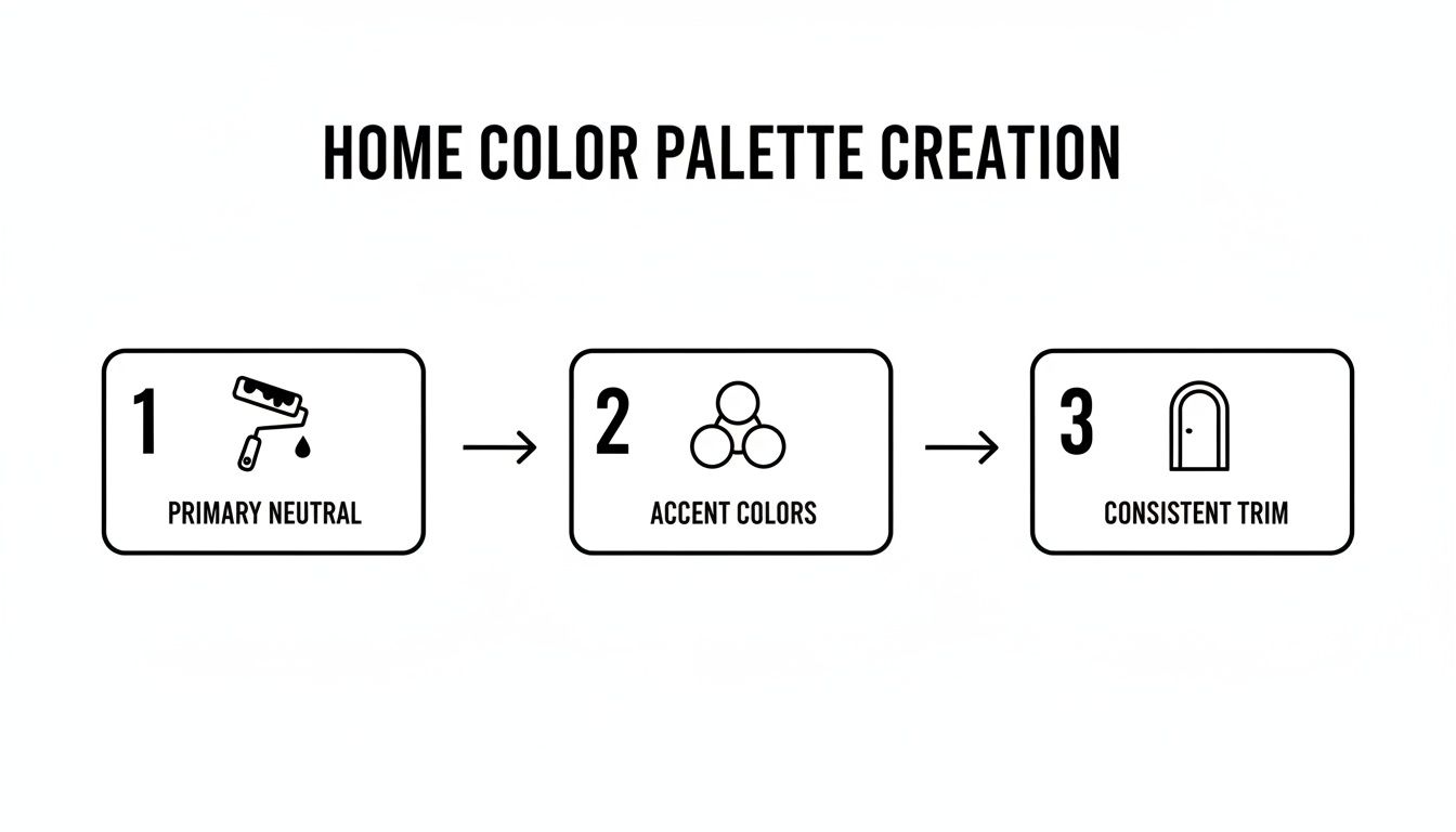
As you can see, a successful color story starts with a primary neutral, gets interesting with well-chosen accent colors, and feels cohesive thanks to consistent trim.
Once you have your large samples painted, the real testing begins. Move them around the room at different times of the day—morning, noon, and late afternoon—to see how dramatically the light can alter the color. Most importantly, place them directly next to your permanent fixtures.
How does the paint look next to the warm tones of your wood-look tile flooring? Does it complement the specific veining in your quartz countertops? Viewing the sample in context with these fixed elements is absolutely crucial for making a confident decision.
This hands-on approach takes all the guesswork out of the process. It's how you ensure the final result is a color you'll love from sunrise to sunset, perfectly enhancing the custom details and luxurious finishes of your new Florida home.
To help you stay on track, we've put together a quick checklist for testing your paint samples like a pro.
Paint Sampling Checklist
Follow these steps to ensure you're seeing your potential paint colors in their truest light, making your final decision much easier and more reliable.
| Step | Action | Pro Tip for Florida Homes |
|---|---|---|
| Get Large Samples | Use large poster boards or peel-and-stick decals for your samples. Aim for at least 12×12 inches. | The intense Florida sun can wash out smaller samples. Bigger is always better for an accurate read. |
| Create a Neutral Frame | Leave a white border around your sample, or apply it to a white background. | This prevents the current wall color from "tricking" your eyes into seeing undertones that aren't there. |
| Move It Around | Place your samples on different walls within the same room. | A color on a wall facing a window will look completely different from one on a wall receiving indirect light. |
| Check All Day | Observe the samples in the morning, at midday, in the late afternoon, and after dark with lights on. | Florida light changes dramatically. What works at 10 AM might feel different at 4 PM. Check all conditions. |
| Test Against Fixtures | Hold samples directly next to flooring, cabinetry, countertops, and tile. | This is non-negotiable. The paint must work with the expensive, permanent elements of your home. |
| Compare Your Finalists | Place your top two or three color samples side-by-side on the same wall. | This helps you clearly see the subtle differences in undertones and choose the one that truly fits the space. |
This checklist is your roadmap to a confident paint choice. By taking the time to test properly, you guarantee that the color you choose is one that will beautifully complete your Sinclair Custom Home.
Choosing Colors with Timeless Resale Appeal
Building your custom home in Southwest Florida is a massive investment. It goes without saying that every choice you make, right down to the color on the walls, plays a role in its long-term value.
While your home absolutely needs to feel like you, thinking strategically about your paint colors can make it a joy to live in and a smart financial asset. It’s all about striking that perfect balance between your personal style and strong resale appeal—a critical factor here in the competitive Florida real estate market.
This really just means looking past fleeting trends and zeroing in on timeless palettes that will speak to a wide range of future homebuyers. Time and time again, neutral-dominant schemes are the safest and most effective strategy. They create a clean, sophisticated canvas that makes it easy for potential buyers to picture their own lives and furniture in the space.
Understanding Market-Savvy Color Choices
When you're thinking about resale value, the goal is to create an atmosphere that feels luxurious, spacious, and move-in ready. Dark, overly specific, or really bold colors can shrink a room visually and become a major turn-off for buyers who immediately see a weekend of repainting in their future.
Instead, we guide our clients toward colors with proven staying power:
- Warm Off-Whites: These shades give off a soft, inviting glow that works beautifully with the incredible Florida sunshine, but without feeling cold or stark.
- Soft Greiges: This is the perfect middle ground between gray and beige. Greige has a sophisticated warmth that pairs well with almost any flooring or cabinetry finish you can imagine.
- Light, Airy Beiges: Think of the natural landscape here in Southwest Florida. Sandy, coastal-inspired beiges create a serene, calming feel the moment you walk in.
A well-chosen neutral palette does more than just look good; it communicates quality and thoughtful design. It quietly suggests that the home has been meticulously cared for and is ready for its next chapter, which can directly boost its perceived value.
This approach lets the exceptional quality of your home's construction—from its solid, elevated foundation to its expertly installed custom trim and molding—truly be the star of the show.
Balancing Trends with Timelessness
It’s smart to keep an eye on color forecasts, but it's crucial to know the difference between a passing fad and a lasting trend. The market data always points back to the enduring appeal of neutrals. For instance, Behr Paints expects neutral greige to dominate 40% of 2025 living room palettes, while Sherwin-Williams notes that earthy tones already claim 65% of sales. This aligns with a broader shift toward authenticity and personal style over chasing fast-fading fads.
But this doesn't mean your home has to be boring! A key new builder trend is to use a neutral backdrop to highlight unique design features, like floating shelves or a statement fireplace. You can bring in bold, trendy colors through things that are easy to change out, like an accent wall, throw pillows, artwork, and other decor.
This lets you enjoy the styles of the moment without committing to a wall color that could date your home in just a few years. By choosing a timeless interior palette, you’re not just painting walls; you’re securing your investment and creating a beautiful home that will stand the test of time.
Your Florida Interior Paint Questions Answered
When you're building a custom home in Southwest Florida, every single detail adds up to create that perfect coastal, luxurious feel you’re after. The interior paint colors you choose are absolutely foundational. Let's dig into some of the most common questions our clients in Cape Coral and Fort Myers have when it's time to make these big decisions.
What Paint Finish Is Best for Florida Humidity?
Living with our high-humidity environment means your paint finish is more than just a look—it's your first line of defense against moisture. For any room that sees a lot of dampness (think bathrooms, kitchens, laundry rooms), a satin or semi-gloss finish isn't just a suggestion; it's essential.
These finishes create a tougher, less porous surface that helps head off mold and mildew growth, which is always a concern in Florida homes. Plus, they're much easier to wipe clean, keeping your walls looking pristine. We always steer our clients toward professional-grade paints with these finishes to guarantee the durability and low-maintenance quality they expect in a new build.
How Do I Match Paint with Custom Wood Cabinets?
Pairing wall colors with the gorgeous custom wood features in a Sinclair Custom Home is what creates that truly high-end, cohesive look. The trick is to first identify the undertone of the wood stain on your cabinets and trim. Is it a warm yellow, a cool gray, or maybe a rich red?
For a smooth, seamless feel, pick a wall color that shares that same undertone. If you're someone who loves a bit more pop and contrast, you can select a complementary color from the other side of the color wheel. A timeless strategy that never fails is to use a sophisticated neutral on the walls, which really lets the superb craftsmanship of the wood become the star of the show.
Should My Entire Open-Concept Home Be One Color?
While painting everything one color is certainly one way to create a unified look, a more refined strategy is to develop a whole-home color palette. This doesn't mean every room is painted the same. Instead, you'll choose one primary neutral for the main living areas and the hallways that connect everything.
From there, you can introduce different shades of that neutral—or even some complementary accent colors—to define specific "zones," like a dining space or a cozy reading corner. The most important thing to tie it all together? Using a single, consistent trim color throughout the entire house. This simple trick adds architectural interest and depth without making the space feel disjointed, which is exactly what you want in a thoughtfully designed custom home.
"Stop fighting your home and start LISTENING to it." This is some of the best advice out there. Your home's fixed elements, like flooring, countertops, and tile, already have a color story. Listening to what they're saying will guide you to a palette that feels natural and intentional.
Can Paint Colors Help My Florida Home Feel Cooler?
They absolutely can. Color has a surprisingly powerful psychological effect on how we perceive temperature. Cool colors—like soft blues, light greens, and crisp, cool-toned grays—can instantly make a room feel more refreshing and airy, which is a welcome relief from the Florida heat. For anyone thinking about future resale value, understanding color psychology in interior design is key to creating a home that appeals to the widest range of potential buyers.
These coastal hues are a natural fit for the Southwest Florida aesthetic, echoing the colors of the water and sky. Lighter, cooler colors also do a better job of reflecting light, which helps a room feel bright without soaking up as much heat as dark shades do. When you pair these smart color choices with modern, energy-efficient building materials and hurricane-impact windows, you get a custom home that is not only beautiful but exceptionally comfortable all year long, especially when powered by a reliable generator during a storm.
Ready to create a home where every detail, from the foundation to the final coat of paint, is executed with precision and care? Contact Sinclair Custom Homes Inc to start the conversation about building your dream home in Southwest Florida. Visit us at https://sinclaircustomhome.com to learn more about our commitment to quality.